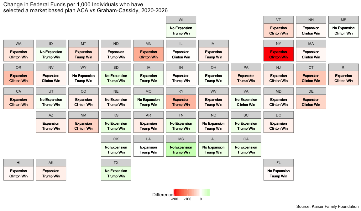
I have been trying to decipher for myself, what is in the current (well, yesterday’s) Graham-Cassidy health care bill. I saw this image on many news outlets a few days ago and my inner hate for pie charts bubbled up.
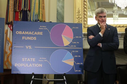
This is a zoom in on the pie chart … From what I can gather, these figures are attempting to say that there are specific states that are getting relatively more of the federal health care funds under the Afordable Care Act (ACA) than their relative state population. Among the many things that are really hard to do with pie charts , comparing distributions ranks pretty high up there.
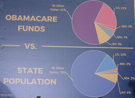
It is common practice when comparing different geographical areas that have different populations levels to scale it using the rate per person (per capita) or per number of people, e.g. rate per 1,000 people. In this case it would be population adjusted state federal funding. The question that needs answering, what is the relevant population.
Many charts in the last week have scaled the funding adjusted to state population (as is alluded to in the figure above), but the funds are not actually being used by everyone in each state, most people have health care from their employer. So, what is the actual population that is being serviced by the federal funding for the ACA? How much of a different picture does that paint from the original figure?
Hopefully this post will help motivate readers to start looking around for more data on what is the effect of the proposed bill on the approprations of federal funds on the state level.
My sources of information is the Kaiser Family Foundation site that have a great database for data on the ACA and the proposed bill, and Wikipedia for auxilary population data. We will end up with the following figure, but along the way I learned a number of things that I didn’t know from reading online and seeing the news on TV.

A quick note before you proceed - This is not meant to be an all encompassing analysis of the predicted effects of the Graham-Cassidy bill, as it has been said before: “Healthcare is hard…”, and if I made any bad assumptions I apologize in advanced and welcome any comments and suggestions to better understand the subject matter.
Saying that, let’s continue:
library(xml2)
library(rvest)
library(dplyr)
library(ggplot2)
library(geofacet)
knitr::opts_chunk$set(fig.height=7,fig.width=12,warning=FALSE,message=FALSE)
Scraping the relevant information
Kaiser Family Foundation
ACA and Graham-Cassidy federal spending by state.
kf_spending <- (xml2::read_html('http://www.kff.org/health-reform/issue-brief/state-by-state-estimates-of-changes-in-federal-spending-on-health-care-under-the-graham-cassidy-bill/')%>%
  rvest::html_table())[[2]][-c(1,2,3,55),]

names(kf_spending) <- c('Location','ACA','GC','DIFF','PCT')

kf_spending$Location[which(kf_spending$Location=='DC')]='District of Columbia'

kf_spending <- kf_spending%>%mutate_at(.vars=vars(ACA,GC,DIFF,PCT),.funs=funs(as.numeric(gsub('[,%]','',.))))
ACA medicare expansion by state
The decision of each state to accept medicare expansion will have a large affect on the net affect of GC on the redistribution of federal funds. States that did not accept medicare expansion are expected to have a net positive increase of federal funds.
#http://www.kff.org/health-reform/state-indicator/state-activity-around-expanding-medicaid-under-the-affordable-care-act/?currentTimeframe=0&sortModel=%7B%22colId%22:%22Location%22,%22sort%22:%22asc%22%7D
kf_expansion <- read.csv('data/kf_expansion.csv',stringsAsFactors = FALSE,skip = 2)
kf_expansion <- kf_expansion[-c(1,53:61),-3]
names(kf_expansion)[2] <- 'Expansion'
Population of ACA enrollment by state.
The target population that will be used to scale the federal funds is the total marketplace enrollment for each state. We also add the characteristic of type of marketplace applied in the state to check if that has any effect.
- Federally-Facilitated Market
- State-based Marketplace
- State-based Marketplace (using HealthCare.gov)
#http://www.kff.org/health-reform/state-indicator/total-marketplace-enrollment/?currentTimeframe=0&sortModel=%7B%22colId%22:%22Total%20Individuals%20Who%20Have%20Selected%20a%20Marketplace%20Plan%22,%22sort%22:%22asc%22%7D
kf_marketplace_pop <- read.csv('data/kf_marketplace_pop.csv',stringsAsFactors = FALSE,skip = 2)
kf_marketplace_pop <- kf_marketplace_pop[-c(1,53:59),]
names(kf_marketplace_pop)[c(2,3)] <- c('Marketplace_Type','N')
Wikipedia
State characteristics (2016 elections and general population)
To gather more characteristics of each state are the 2016 general election results and the total population in each state, so the prevalent scaling can be used as a comparison.
wiki_elections <- (xml2::read_html('https://en.wikipedia.org/wiki/United_States_presidential_election,_2016')%>%
        rvest::xml_nodes(xpath='//*[@id="mw-content-text"]/div/div[40]/table')%>%
        rvest::html_table())[[1]][-c(1,58),c(1,3,6,23)]

names(wiki_elections) <- c('Location','Clinton','Trump','Total')

wiki_elections$Location[grep('^Nebraska',wiki_elections$Location)] <- 'Nebraska'
wiki_elections$Location[grep('^Maine',wiki_elections$Location)] <- 'Maine'

wiki_elections <- wiki_elections%>%
  mutate_at(.vars = vars(Clinton,Trump,Total),.funs=funs(as.numeric(gsub('[,]','',.))))%>%
  group_by(Location)%>%summarise_at(.vars = vars(Clinton,Trump,Total),.funs = funs(sum))%>%
  mutate(ClintonPct=Clinton/Total,TrumpPct=Trump/Total,TrumpWin=ifelse(TrumpPct>ClintonPct,'Trump Win','Clinton Win'))

wiki_pop <- (xml2::read_html('https://en.wikipedia.org/wiki/List_of_U.S._states_and_territories_by_population')%>%
        rvest::xml_nodes(xpath='//*[@id="mw-content-text"]/div/table[1]')%>%
        rvest::html_table())[[1]][-c(30,53:64),c(3,4)]

names(wiki_pop) <- c('Location','Total_N')

wiki_pop$Total_N <- as.numeric(gsub('[,]','',wiki_pop$Total_N))
Join all the data sets
We join all the information and create a new variable - the change in federal funds from ACA to GC. This is done for the rate per 1,000 individuals who have selected a market based plan and the broader per 1,000 individuals state total. The former assumes that this the more consice defition of the population better reflects what is the population serviced by the federal funding, and that it is the potential population that would be serviced by the GC bill.
kf <- kf_marketplace_pop%>%
  left_join(kf_expansion,by='Location')%>%
  left_join(wiki_pop,by='Location')

kf <- kf_spending%>%left_join(kf, by = c('Location'))%>%
  mutate(ratio_ACA=1000*ACA/N,ratio_GC=1000*GC/N,ratio_DIFF = ratio_GC-ratio_ACA,
         tot_ratio_ACA=1000*ACA/Total_N,tot_ratio_GC=1000*GC/Total_N,tot_ratio_DIFF = tot_ratio_GC-tot_ratio_ACA)%>%
  arrange(desc(ratio_DIFF))

kf <- kf%>%left_join(wiki_elections,by='Location')

kf$Expansion <- sprintf('Medicaid Expansion %s',kf$Expansion)

kf$Location <- factor(kf$Location,levels = kf$Location)

kf$Marketplace_Type <- factor(kf$Marketplace_Type,labels=c('Federally-Facilitated Market','State-based Marketplace','State-based Marketplace (using HealthCare.gov)'))
Plots
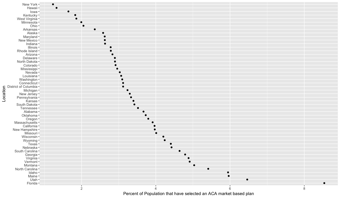
Percent of state population enrolled in ACA
First we want to see what is the scope of the population in each state that have selected an ACA market based plan. (note California… not quite 12% of the US population)
kf%>%
  mutate(pop_pct=100*N/Total_N)%>%
  arrange(desc(pop_pct))%>%
  mutate(Location=factor(Location,levels=Location))%>%
  ggplot(aes(x=Location,y=pop_pct))+
  geom_point()+
  coord_flip()+
  labs(y='Percent of Population that have selected an ACA market based plan')
Overall distribution by Medicare Expansion
We then check that there really is a difference between states that expanded and did not expand medicaid under the ACA and if being a state that voted Republican compared to Democratic.
boxplot_dat <- kf%>%
  dplyr::select(Expansion,Marketplace_Type,TrumpWin, ratio_DIFF,tot_ratio_DIFF)%>%
  reshape2::melt(.,id=c('Marketplace_Type','Expansion','TrumpWin'))

levels(boxplot_dat$variable) <- c('per 1,000 Individuals who have\nselected a market based plan','per 1,000 Individuals')

  boxplot_dat%>%
    ggplot(aes(x=Expansion,
             y=value,
             fill=TrumpWin))+
  geom_boxplot()+
  geom_hline(aes(yintercept=0),linetype=2)+
  facet_wrap(~variable,ncol=1,scales='free_y')+
  labs(title='Change in Federal Funds ACA vs Graham-Cassidy, 2020-2026',
         y='Change in Federal Funds ($ Millions) per 1,000 individuals')+
  theme_bw()+
  theme(legend.position = 'bottom')
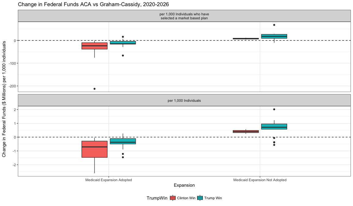
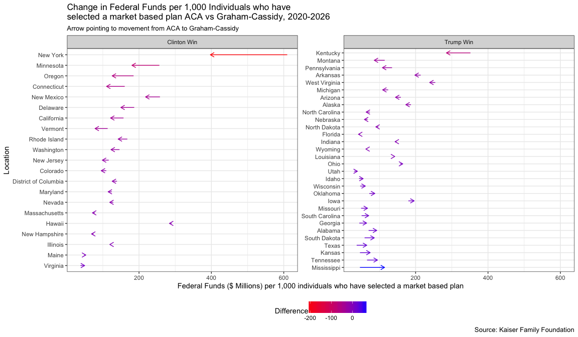
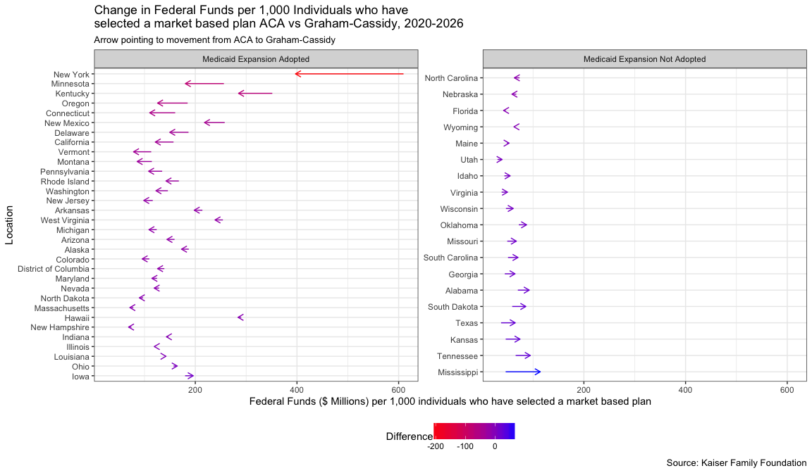
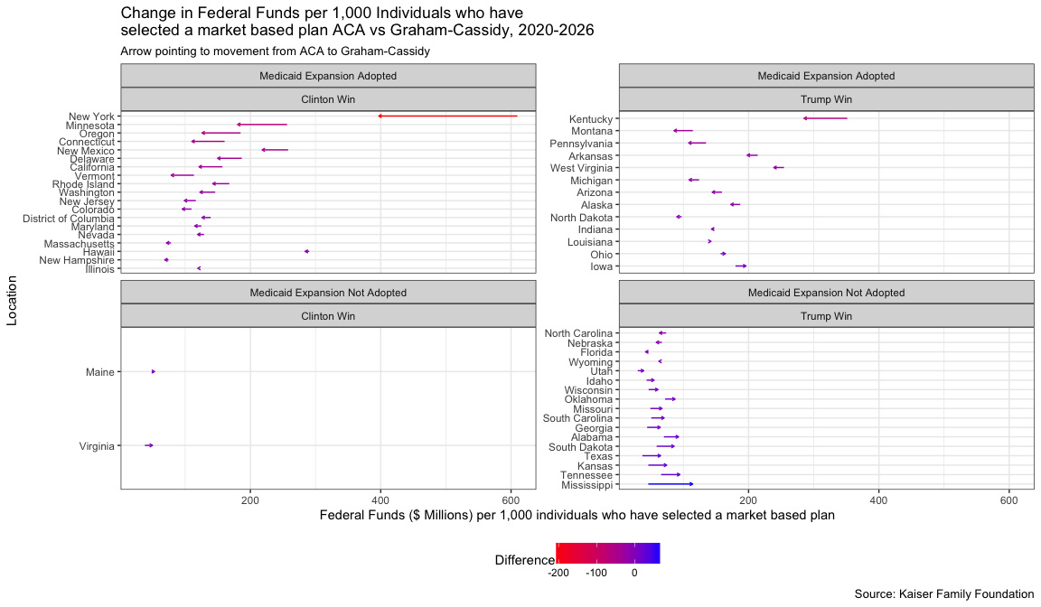
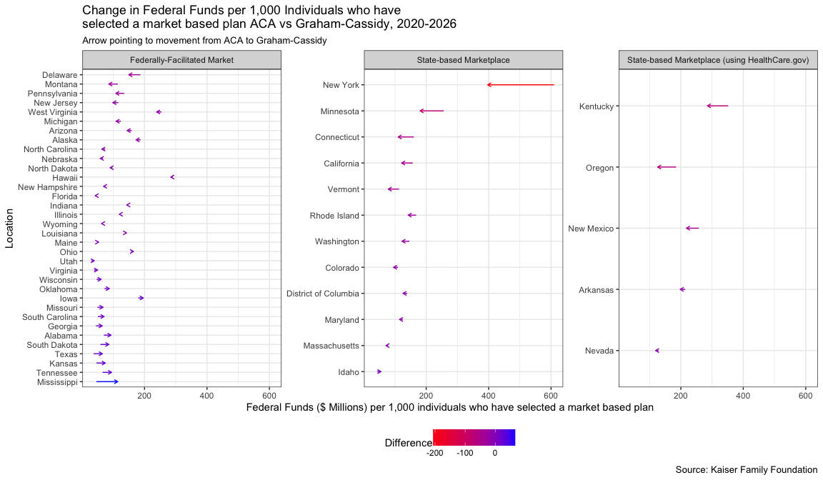
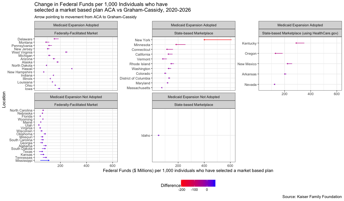
Drilling down to state level figures we show for each state the change from ACA funding to the proposed GC funding per 1,000 persons who selected a market based ACA plan. The arrows move from ACA to GC funding and the y-axis is ordered by the increasing net difference. This comparison is faceted among the different characteristics scrapped from above.
Some things to look for:
- New York has the largest negative net funding per 1,000 persons.
- Kentucky has the largest negative net funding per 1,000 persons among Republican leaning states.
- The net increase in funding per 1,000 persons for states that did not expand medicaid is mostly minimal.
p <- kf%>%ggplot(aes(x=Location,xend=Location,yend=ratio_GC,y=ratio_ACA,colour=ratio_DIFF))+
  geom_segment(arrow = arrow(length = unit(0.02, "npc")))+
  coord_flip()+
  scale_colour_gradient(low = 'red',high = 'blue',name='Difference')+
  labs(title='Change in Federal Funds per 1,000 Individuals who have\nselected a market based plan ACA vs Graham-Cassidy, 2020-2026',
       subtitle='Arrow pointing to movement from ACA to Graham-Cassidy',
       caption='Source: Kaiser Family Foundation',
       y='Federal Funds ($ Millions) per 1,000 individuals who have selected a market based plan')+
  theme_bw()+
  theme(legend.position = 'bottom')
Policial Leaning
p + facet_wrap(~ TrumpWin , scales='free_y')
ACA Medicare expansion
p + facet_wrap(~ Expansion , scales='free_y')
ACA Medicare expansion and Political Leaning
p + facet_wrap(~ Expansion + TrumpWin , scales='free_y')
State Marketplace Type
p + facet_wrap(~ Marketplace_Type, scales='free_y')
ACA Medicare expansion and State Marketplace Type
p + facet_wrap(~ Expansion + Marketplace_Type , scales='free_y')
Geofaceting
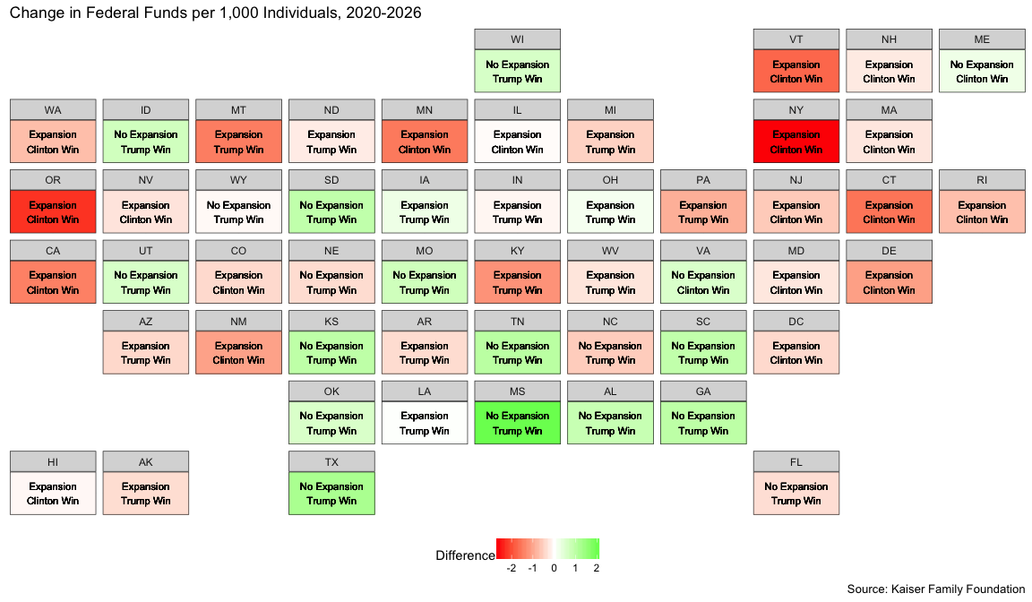
Lastly, we construct geographic representation of the difference between the ACA and the GC bill using Ryan Hafen’s geofacet package.
states_facet <- state_ranks%>%left_join(kf%>%rename(name=Location),by='name')

states_facet$Expansion <- factor(states_facet$Expansion,labels=c('Expansion','No Expansion'))

states_facet$tile_lbl <- sprintf('%s\n%s',states_facet$Expansion,states_facet$TrumpWin)
Total State Population
states_facet%>%
  ggplot(aes(x='1', y='1',fill=tot_ratio_DIFF)) +
  geom_tile() +
  geom_text(aes(label=tile_lbl),size=2)+
  theme_bw() +
  facet_geo( ~ state)+
  scale_fill_gradient2(low='red',mid='white',high='green',name='Difference') +
  theme(legend.position = 'bottom',
        axis.text = element_blank(),
        axis.title = element_blank(),
        axis.ticks = element_blank())+
  labs(title='Change in Federal Funds per 1,000 Individuals, 2020-2026',
       caption='Source: Kaiser Family Foundation')
ACA enrollment population
states_facet%>%
  ggplot(aes(x='1', y='1',fill=ratio_DIFF)) +
  geom_tile() +
  geom_text(aes(label=tile_lbl),size=2)+
  theme_bw() +
  facet_geo( ~ state)+
  scale_fill_gradient2(low='red',mid='white',high='green',name='Difference') +
  theme(legend.position = 'bottom',
        axis.text = element_blank(),
        axis.title = element_blank(),
        axis.ticks = element_blank())+
  labs(title='Change in Federal Funds per 1,000 Individuals who have\nselected a market based plan ACA vs Graham-Cassidy, 2020-2026',
       caption='Source: Kaiser Family Foundation')
